What is Flutter ?
Flutter is an open-source UI software development toolkit created by Google. It is designed to enable the development of natively compiled applications for mobile, web, and desktop from a single codebase. Released in 2017, Flutter has gained immense popularity among developers for its ability to provide a consistent and beautiful user experience across different platforms.
Key Features and Advantages:
Single Codebase:
One of Flutter's main strengths is the ability to write code once and run it on multiple platforms, including iOS, Android, web, and desktop.
Expressive UI:
Flutter allows developers to create highly expressive and flexible user interfaces using a wide range of pre-designed widgets. Widgets are the building blocks of a Flutter app, representing everything from buttons and text to complex layouts.
Fast Development:
The hot reload feature in Flutter significantly speeds up the development process. Developers can instantly see the impact of changes they make to the code without restarting the entire application.
Rich Set of Widgets:
Flutter provides a rich set of customizable widgets for creating modern and responsive user interfaces. These widgets adhere to the Material Design guidelines for Android and the Cupertino design language for iOS.
Strong Community Support:
Flutter has a vibrant and active community of developers. This community contributes to the ecosystem by developing plugins, packages, and providing support through forums and social media.
Why Use Flutter?
Consistency Across Platforms:
Flutter helps maintain a consistent look and feel across various platforms, eliminating the need to create separate codebases for iOS and Android.
Productive Development:
With features like hot reload, developers can experiment, build, and fix bugs faster, leading to increased productivity.
Access to Native Features:
Flutter provides a rich set of plugins that allow developers to access native device features seamlessly, ensuring that the full capabilities of the device can be utilized.
Growing Ecosystem:
The Flutter ecosystem is continually expanding with new packages, plugins, and tools, making it an exciting and evolving framework to work with.
In the next section, we will guide you through the process of setting up Flutter on your development environment.
App Bar
To use appbar, you just need to click on appbar icon on navigation section. It will be added appbar to your page and shown to the widget tree.
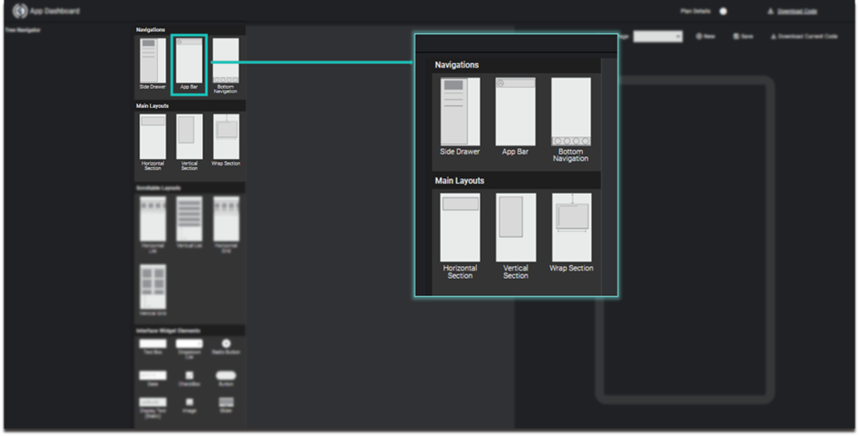
Image - Select app bar
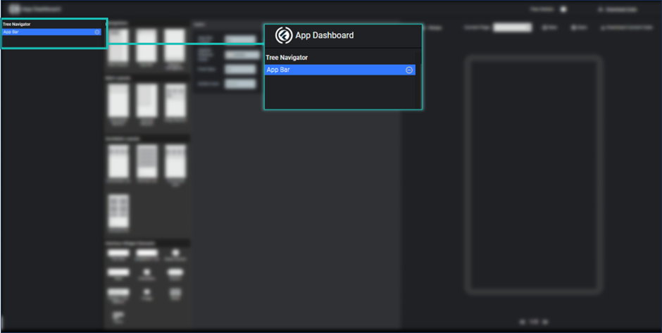
Image - appbar added to widget tree
App bar properties are shown by clicking appbar in widget tree and you change its color, title, fontsize and icon etc.
For getting change just click on save button, it will shows you the preview of your appbar.
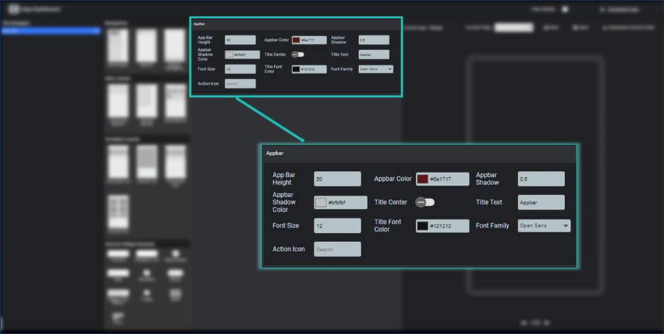
Image- appbar properties are shown
Side Drawer
To use Side drawer, you just need to click on sidedrawer icon on navigation section. It will be added to your page and widget tree.
Image - add side drawer
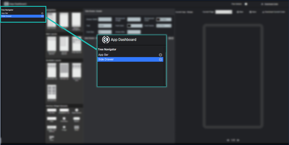
Image -side drawer in widget tree
By clicking on side drawer in widget tree we can get all properties of side drawer at the right side of elements section.
Here you can change its properties accordingly.
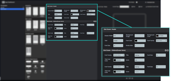
Image - side drawer properties
Bottom Navigation
To use bottom navigation, you just need to click bottom navigation item on navigation section. After clicking it, it will be added to your page and widget tree.
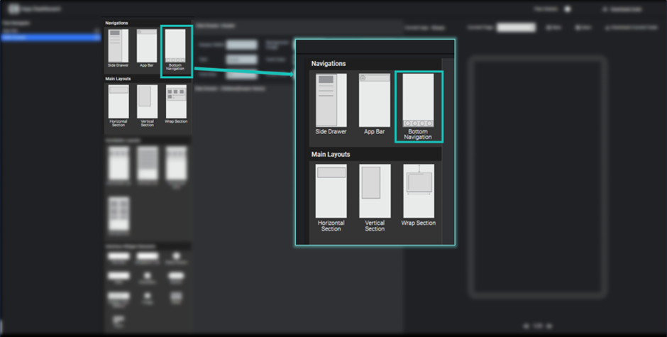
Image - bottom navigation bar
For changing its properties you just need to select bottom navigation from the list of widgets in widget tree and respective properties are shown.
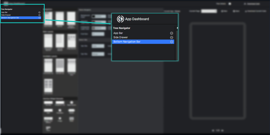
Image - bottom navigation bar in widget tree
Here you can add the tabs which you want to show at your page.
Here you can change bottom navigation background color, shadow, selected icon color and so on.
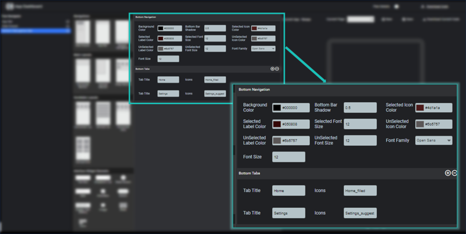
Image - bottom navigation properties
To add a tab, you need to click on plus icon show in front of bottom Tabs heading on properties section. Each page has two different properties label and icon.
You can remove last added tab by clicking minus icon
Horizontal Section
To use horizontal section, you just need to click on horizontal section on main layouts section. It will be added to your page and widget tree. Respective properties are shown on the properties section.
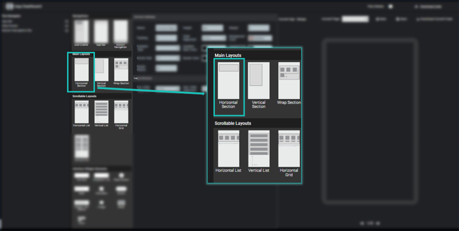
Image - select horizontal section
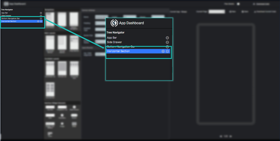
Image - horizontal section in widget tree
Here you can modify properties of horizontal section like height, margin, padding, background color, border, child alignment etc.
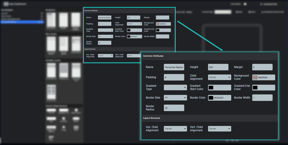
Image - horizontal section properties
It will create a horizontal box, in which all incoming elements are aligned into a horizontal direction (left to right).
To add children into horizontal section, you just need to click on plus icon shown at horizontal section in widget tree. It will be added a empty child to this horizontal section.
To add a widget at this child, you need to click on child in widget tree and select any element from elements section that can be a text widget, image widget, slider or any layouts.
As per your choice properties section show the properties of selected widget element for this child.
You can multiple different element as child into horizontal section.
You can remove any child after clicking minus(-) at right side of child element in widget tree.
If you remove any parent section, it will also remove all children it has.
Vertical Section
To use vertical section, you just need to click on vertical section on main layouts section. It will be added to your page and widget tree. Respective properties are shown on the properties section.
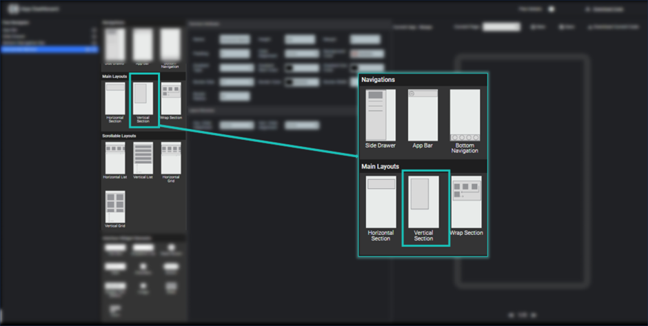
Image - Vertical Section
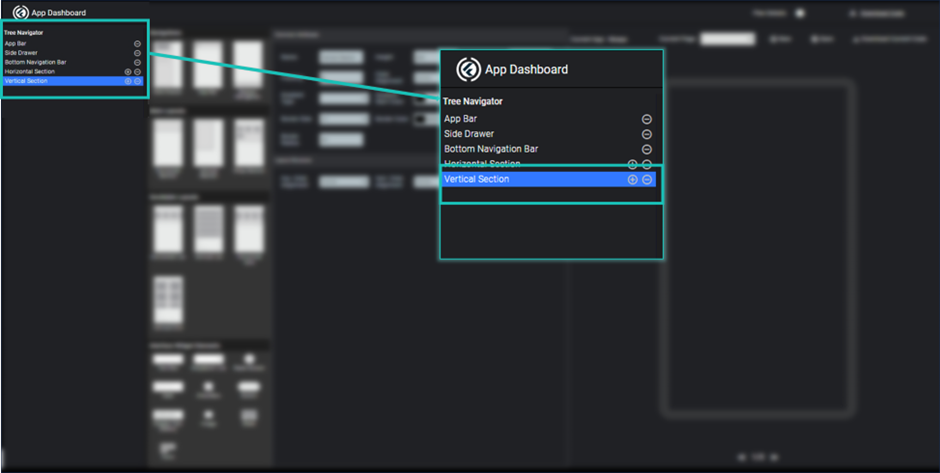
Image - Vertical Section in widget tree
Here you can modify properties of vertical section like height, margin, padding, background color, border, child alignment etc.
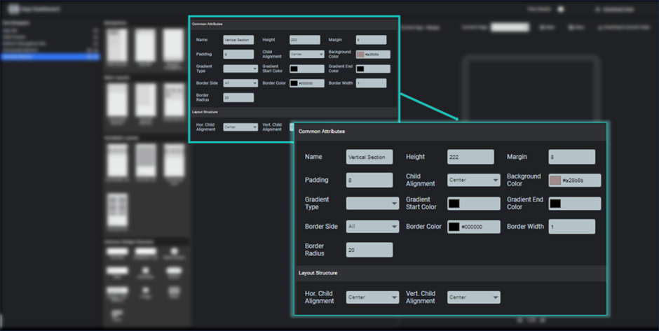
Image - Vertical Section Properties
It will create a vertical box, in which all incoming elements are aligned into a vertical direction (top to bottom).To add children into vertical section, you just need to click on plus icon shown at vertical section in widget tree. It will be added a empty child to this vertical section.
To add a widget at this child, you need to click on child in widget tree and select any element from elements section that can be a text widget, image widget, slider or any layouts.
As per your choice properties section show the properties of selected widget element for this child.
You can multiple different element as child into vertical section.
You can remove any child after clicking minus(-) at right side of child element in widget tree.
If you remove any parent section, it will also remove all children it has.
Wrap Section
Wrap section is used when you want to use horizontal and vertical layout together. Show elements in a horizontal direction (left to right) in the given width and whenever width is finish move next element to next line and again show in horizontal direction.
To use wrap section, you just need to click on wrap section on main layouts section. It will be added to your page and widget tree. Respective properties are shown on the properties section.
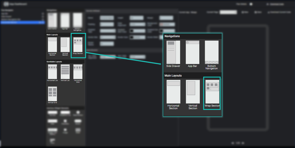
Image - Select Wrap Section
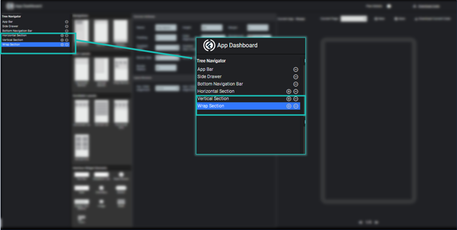
Image - Wrap Section in Widget Tree
Here you can modify properties of vertical section like height, margin, padding, background color, border, child alignment etc.
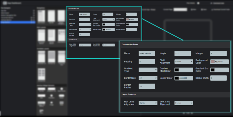
Image - Wrap Section Properties
To add children into wrap section, you just need to click on plus icon shown at wrap section in widget tree. It will be added a empty child to this vertical section.
To add a widget at this child, you need to click on child in widget tree and select any element from elements section that can be a text widget, image widget, slider or any layouts.
As per your choice properties section show the properties of selected widget element for this child.
You can multiple different element as childinto wrap section.
You can remove any child after clicking minus(-) at right side of child elementin widget tree. If you remove anyparent section, it will also remove all children it has.
Horizontal List
To use horizontal list, you just need to click on horizontal list on scrollable layouts section. It will be added to your page and widget tree. Respective properties are shown on the properties section.
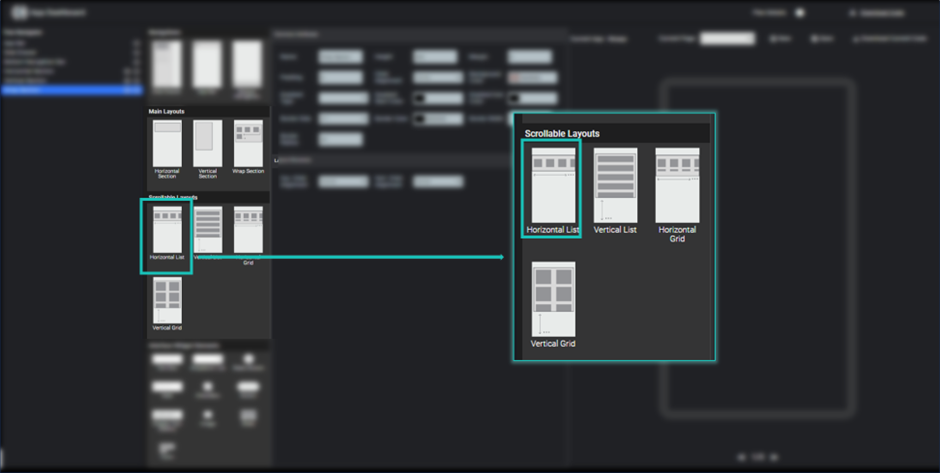
Image - Select Horizontal list
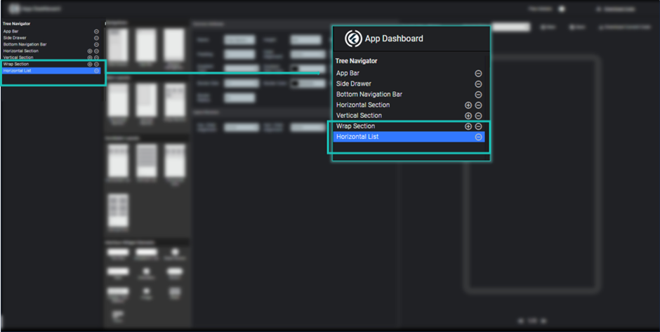
Image - Horizontal List in Widget Tree
Here you can modify properties of horizontal list like height, margin, padding, background color, border, child alignment etc.
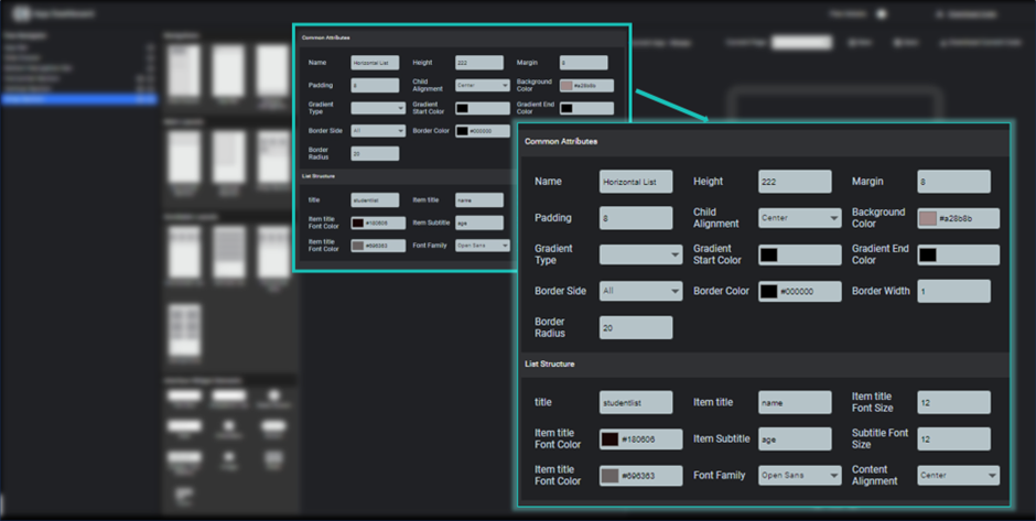
Image - Horizontal List Properties
It will create a list in horizontal direction(left to right) which contains similar design items with different data. This list is scrollable as per the data given to it.
To show child list of horizontal list, you need to give a name of your list and what will be the title heading and subtitle heading of your list which you need to be shown in the list items. It will be create a dummy list as per your specification and can be view in preview.
Here you can modify the font title size and color, subtitle font size and color and fontfamily.
You can also specify the child alignment of each and every element inside the list.
Vertical List
To use vertical list, you just need to click on vertical list(top to bottom) on scrollable layouts section. It will be added to your page and widget tree. Respective properties are shown on the properties section.
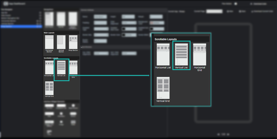
Image - Select Vertical List
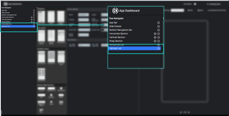
Image - Vertical List in widget tree
Here you can modify properties of vertical list like height, margin, padding, background color, border, child alignment etc.
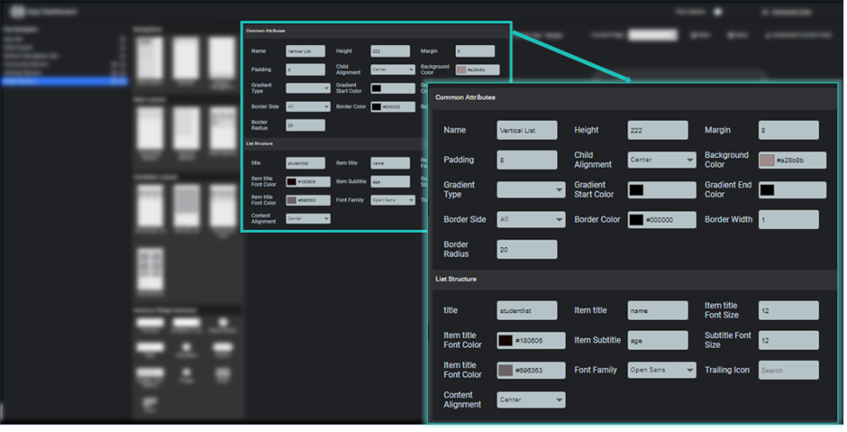
Image - Vertical list Properties
It will create a list in vertical direction which contains similar design items with different data. This list is scrollable as per the data given to it.
To show child list of vertical list, you need to give a name of your list and what will be the title heading and subtitle heading of your list which you need to be shown in the list items. It will be create a dummy list as per your specification and can be view in preview.
Here you can modify the font title size and color, subtitle font size and color and fontfamily.
You can also specify the child alignment of each and every element inside the list.
Horizontal Grid
Horizontal grid is used to create a grid layout in horizontal direction. Here you can define number of grids in horizontal direction.
To use horizontal grid, you just need to click on horizontal grid on scrollable layouts section. It will be added to your page and widget tree. Respective properties are shown on the properties section.
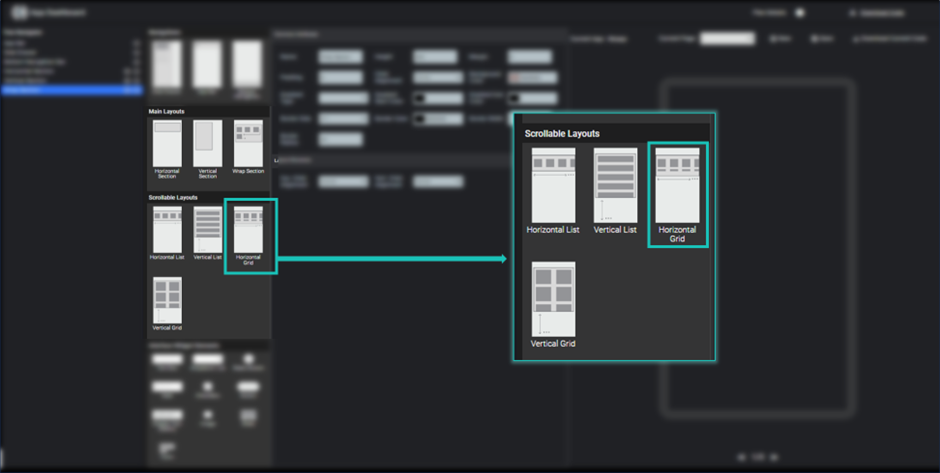
Image - Horizontal Grid
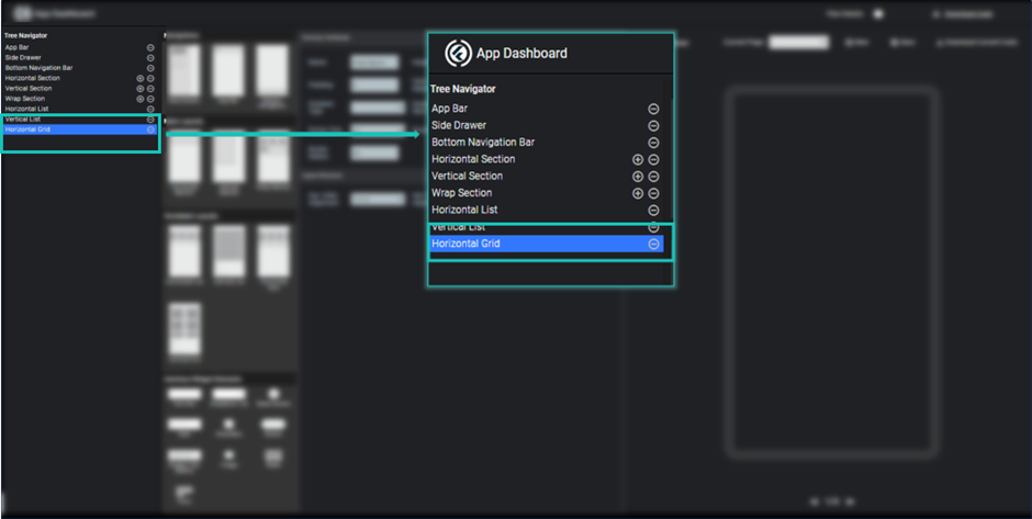
Image - Horizontal Grid in Widget tree
Here you can modify properties of horizontal grid like height, margin, padding, background color, border, child alignment etc.
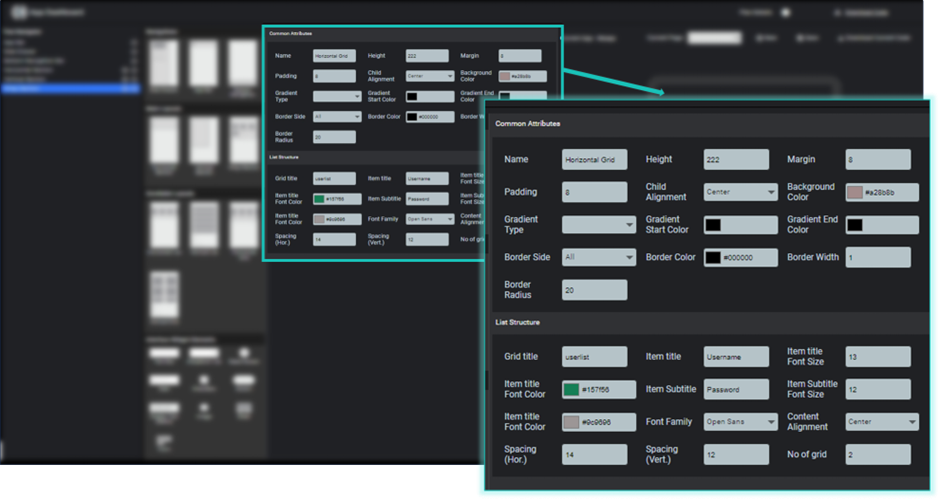
Image - Horizontal Grid Properties
It will create a grid layout in horizontal direction which contains similar design items with different data. This list is scrollable as per the data given to it and specified width.
To show child elements of horizontal grid, you need to give a name of your list and what will be the title heading and subtitle heading of your list which you need to be shown in the list items. It will be create a dummy list as per your specification and can be view in preview.
Here you can modify the font title size and color, subtitle font size and color and font-family, horizontal and vertical spacing between the grid items and no of grids you want to show.
You can also specify the child alignment of each and every element inside the list.
Vertical Grid
Vertical grid is used to create a grid layout in vertical direction. Here you can define number of grids in vertical direction.
To use vertical grid, you just need to click on vertical grid on scrollable layouts section. It will be added to your page and widget tree. Respective properties are shown on the properties section.
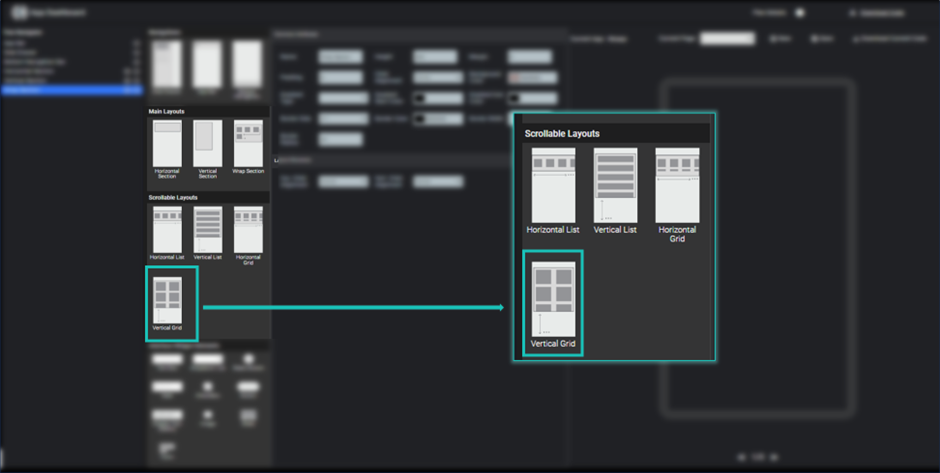
Image - Vertical Grid
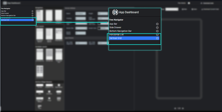
Image - Vertical Grid in Widget Tree
Here you can modify properties of vertical grid like height, margin, padding, background color, border, child alignment etc.
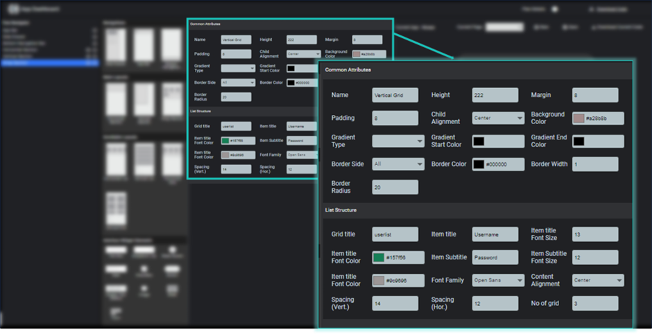
Image - Vertical Grid Properties
It will create a grid layout in vertical direction which contains similar design items with different data. This list is scrollable as per the data given to it and specified height.
To show child elements of vertical grid, you need to give a name of your list and what will be the title heading and subtitle heading of your list which you need to be shown in the list items. It will be create a dummy list as per your specification and can be view in preview.
Here you can modify the font title size and color, subtitle font size and color and font-family, horizontal and vertical spacing between the grid items and no of grids you want to show.
You can also specify the child alignment of each and every element inside the list.
TextBox
TextBox is used to get input from the user. To create a text input into your page, you just need to click textbox element inside the interface widget element section.
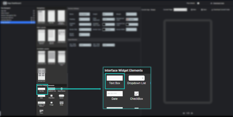
Image - TextBox
After clicking on textbox element, it will be shown into the widget tree and respective properties are shown in the property section.
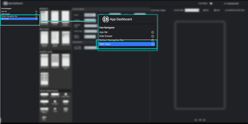
Image - TextBox in widget tree
Here you can modify its title/ label, background color, height, width and so on.
You can see its preview by clicking save button.
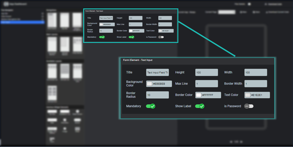
Image - TextBox Properties
Dropdown list
Dropdown list is used to allows user to select a single element among the multiple items. To add a dropdown list into your page, you just need to click dropdown list element inside the interface widget element section.
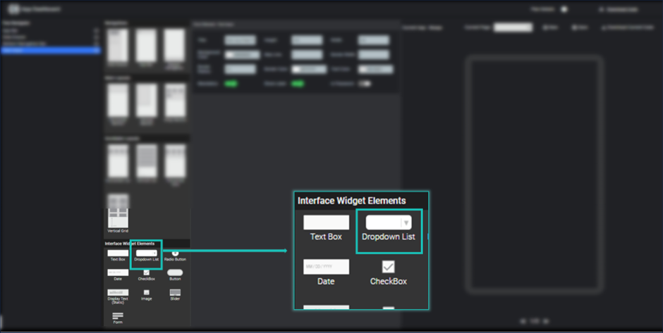
Image - Dropdown List
After clicking on dropdown list element, it will be shown into the widget tree and respective properties are shown in the property section.
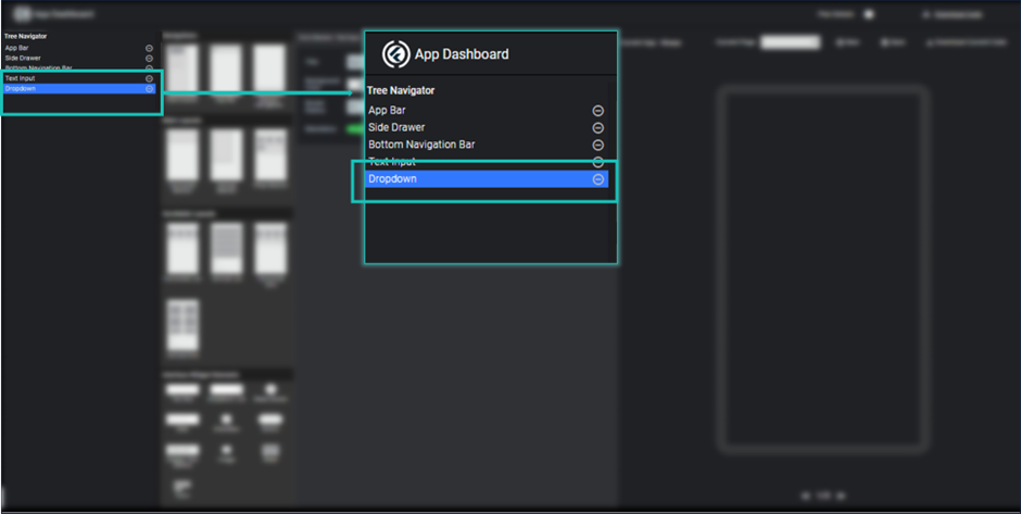
Image - Dropdown list in widget tree
Here you can modify its title/ label, background color, height, width and so on.
Here you can specified all dropdown list item by separating them with comma. You can see its preview by clicking save button.
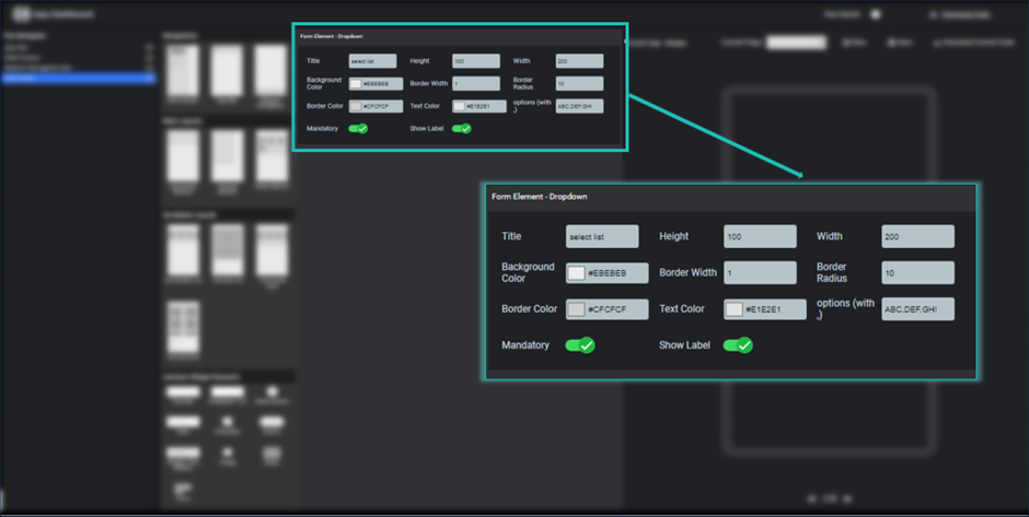
Image - Dropdown Properties
Radio Button
Radio Button is used to allows user to choose an item among the two or above number of items. To add a list of radio button into your page, you just need to click radio element inside the interface widget element section.
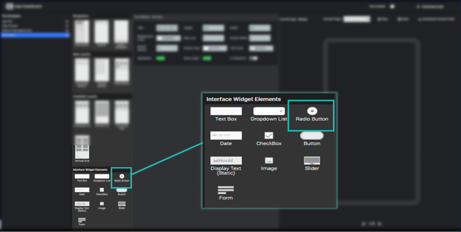
Image - Radio Button
After clicking on radio button element, it will be shown into the widget tree and respective properties are shown in the property section.
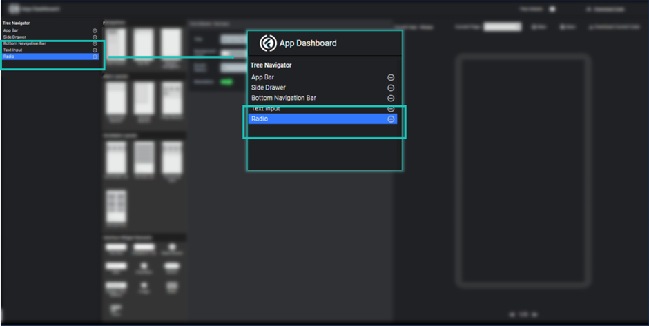
Image - Radio Button in Widget tree
Here you can modify its title/ label, background color, height, width, active button color and so on.
Here you can specified all radio button items by separating them with comma. You can see its preview by clicking save button.
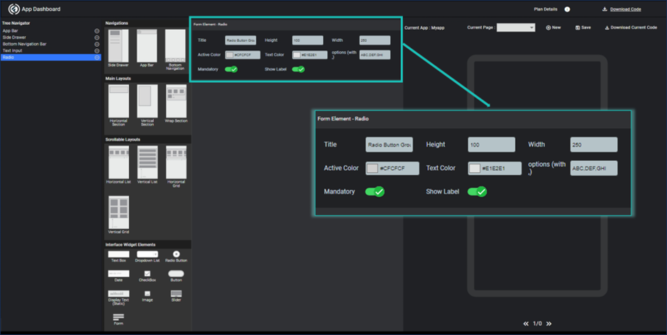
Image - Radio button properties
Date
Date is used to allows user to enter date input. To add a date input into your page, you just need to click date icon inside the interface widget element section.
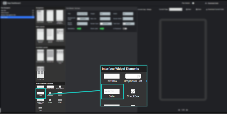
Image - Date
After clicking on date element, it will be shown into the widget tree and respective properties are shown in the property section.
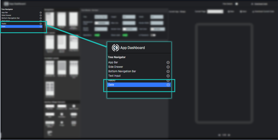
Image - Date in widget tree
Here you can modify its title/ label, background color, height, width, border color and so on. You can see its preview by clicking save button.
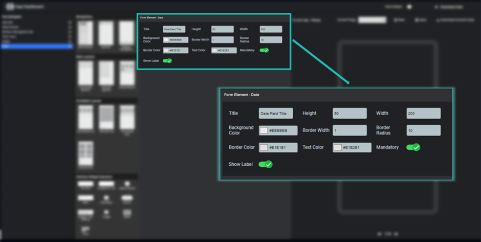
Image - Date properties
Checkbox
Checkbox can be used to allows user to agree on some condition. To add a checkbox element into your page, you just need to click checkbox icon inside the interface widget element section.
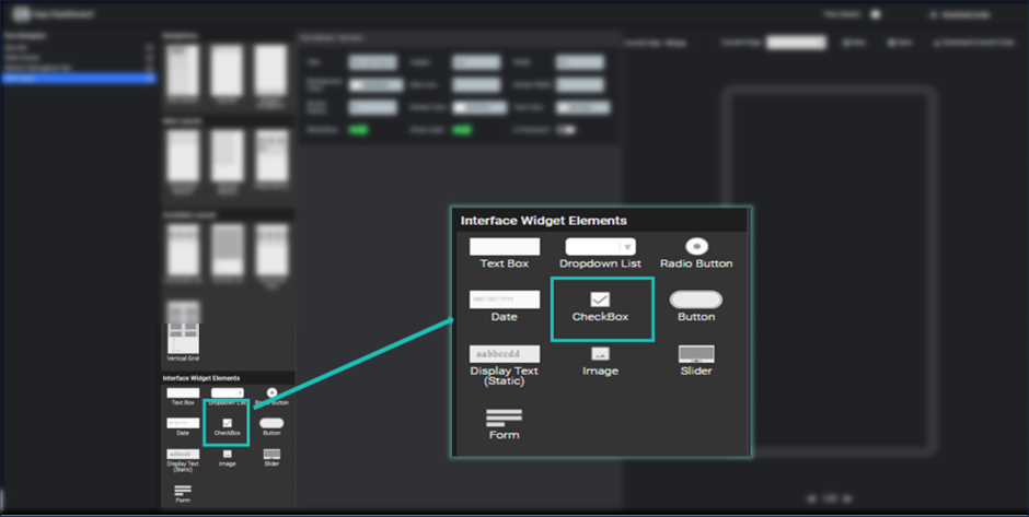
Image - Checkbox
Checkbox can be used to allows user to agree on some condition. To add a checkbox element into your page, you just need to click checkbox icon inside the interface widget element section.
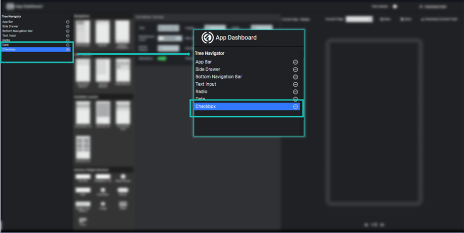
Image - Checkbox in Widget tree
Here you can modify its title/ label, background color, height, width, active color and so on. You can see its preview by clicking save button.
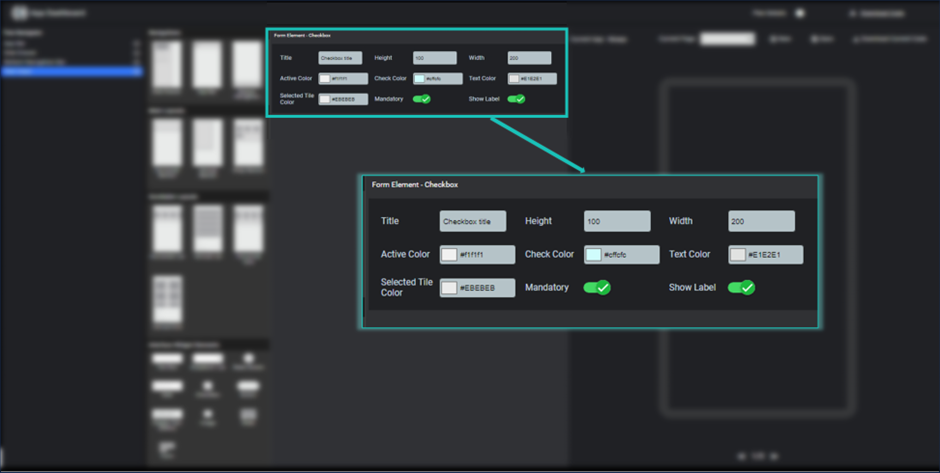
Image - Checkbox properties
Button
Button element can be used to add an individual button to allow user to perform some action on click. To add a button element into your page, you just need to click button icon inside the interface widget element section.
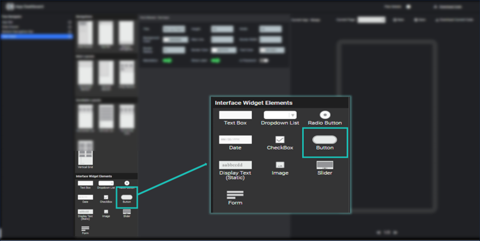
Image - Button
After clicking on button element, it will be shown into the widget tree and respective properties are shown in the property section.
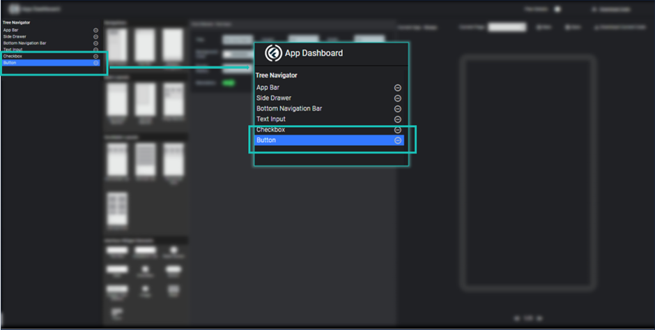
Image - Button in Widget tree
Here you can modify its title/ label, background color, height, width, shadow and so on. You can see its preview by clicking save button.
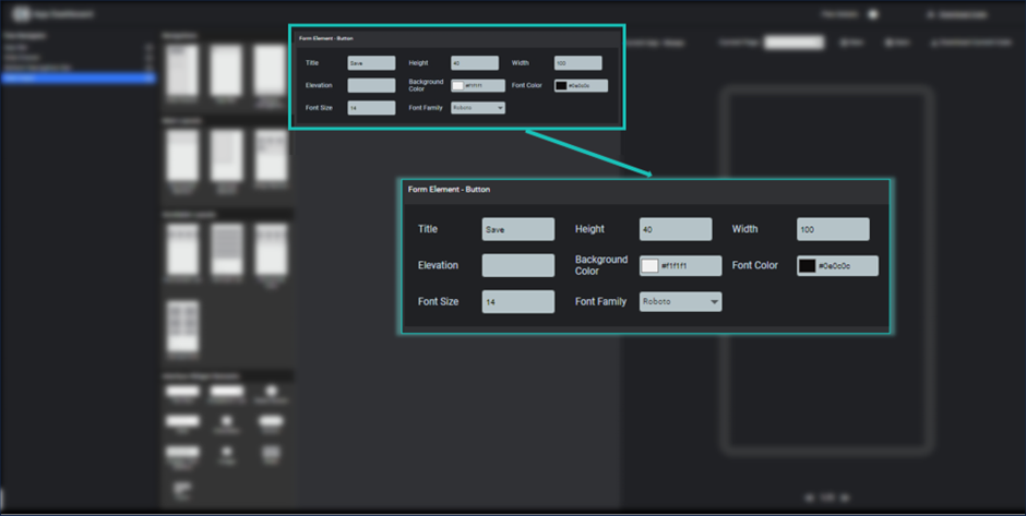
Image - Button Properties
Display Text (Static)
Display text element can be used to show some static/dynamic text on the screen. It can be a welcome message for user, name of the user or anything which contains text content only.
To add display text element into your page, you just need to click Display text icon inside the interface widget element section.
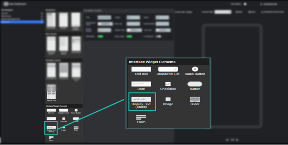
Image - Display Static
After clicking on Display text element, it will be shown into the widget tree and respective properties are shown in the property section.
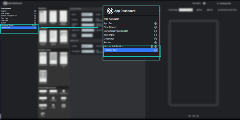
Image - Display Text in widget tree
Here you can modify its title/ label, background color, height, width, shadow and so on.
Here you can define text content properties too, in which you have to specify the text content which you want to display with their properties like font size, font color, text alignment, font family etc. You can see its preview by clicking save button.
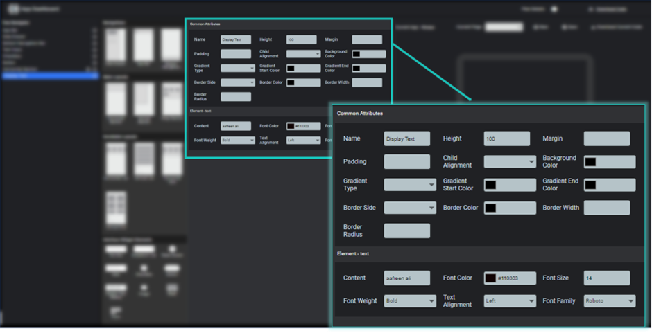
Image- Display Text Properties
Image
Image element can be used to show image on the screen. It can be a network image or asset image.
To add image element into your page, you just need to click image icon inside the interface widget element section.
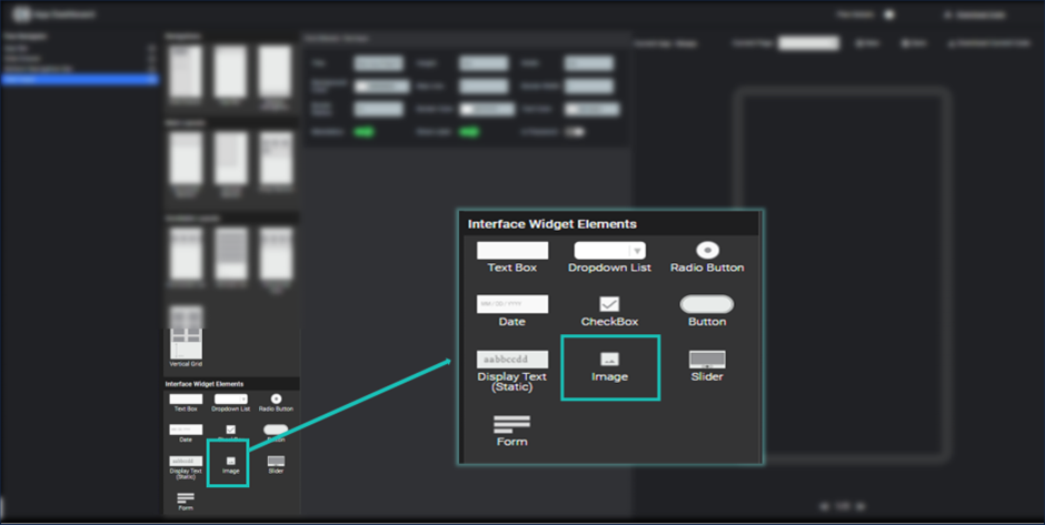
Image - Select Image Element
After clicking on image element, it will be shown into the widget tree and respective properties are shown in the property section.
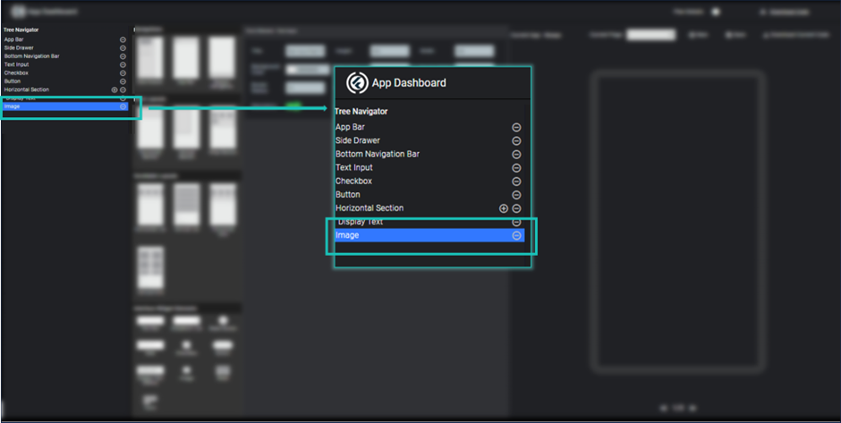
Image - Image Element in widget tree
Here you can modify its title/ label, background color, height, width and so on.
Here you can define image properties too, in which you have to specify the source of image which you want to display with their properties like image height, image width and image color.
By single toggle switch you can specify it will be a network image or asset image.For adding asset image, you need to add image into your asset folder and add it to pubspec file. You can see its preview by clicking save button.
Note: Here we can give instructions for adding asset to pubspec file.
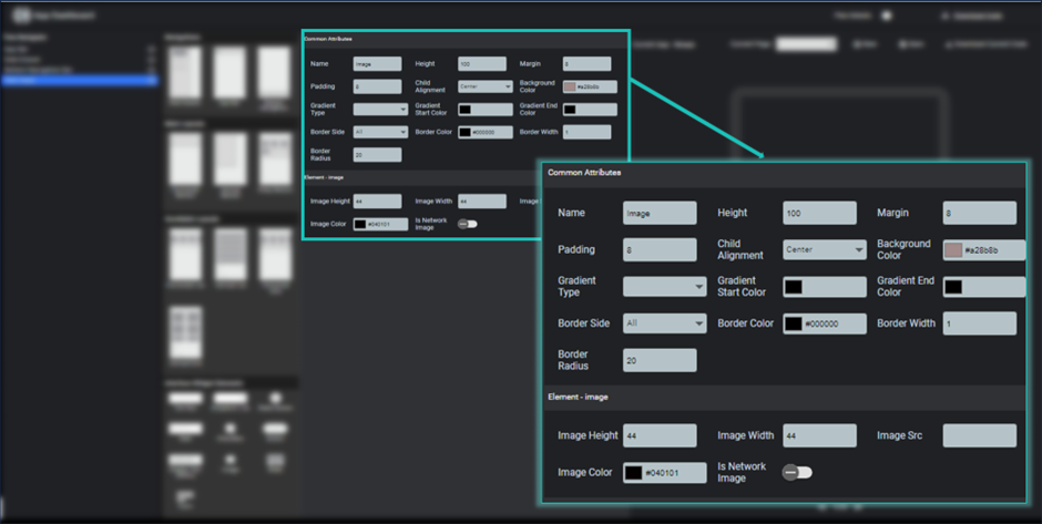
Image - Image Element Porperties
Slider
Image Slider is used to create a carousel in flutter mobile app. It has two or three images which continuously slide one by one in the given duration.
To adding an image slider in your screen, you just need to click on slider icon and it will be added to your widget tree.
Respective properties are shown at the property section.
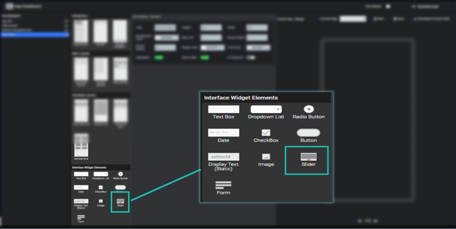
Image - Slider Properties
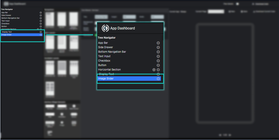
Image - Slider in widget tree
Here you can change its common attributes like height, width, background color, border color etc.
Here slider options are given which you can modify as per your choice, you have to add two or three network image sources by separating them comma.
Here you can also specify indicator which will be displayed on the slider and represents current slide. Here you can specify indicator shape and current slide indicator color. You can also specify sliding time duration in milliseconds, that slide each image in the given duration.
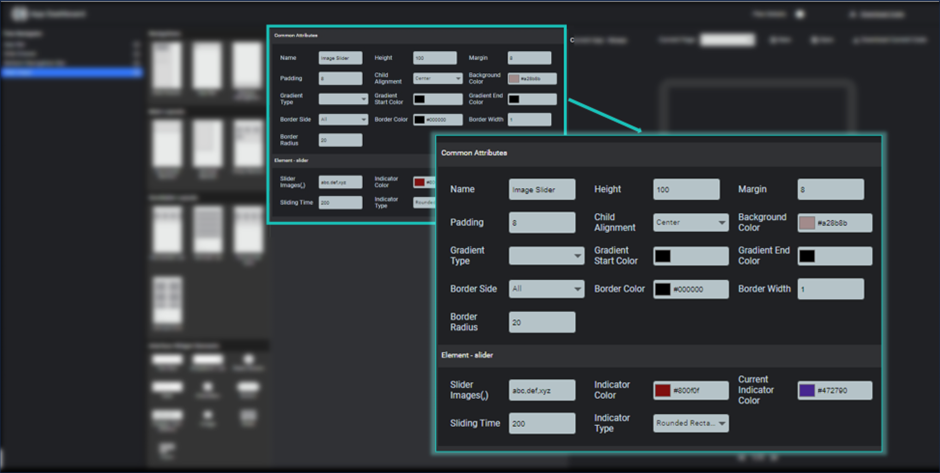
Image - Slider Properties
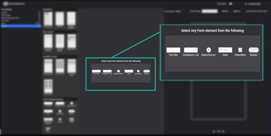
Form
Form is used to add any type of form into your screen. Here you can add a layout of form with default save button.
To adding a form, you just need to click on form element inside the interface widget elements section. After clicking, it will be added to widget tree and respective properties are shown in the properties section.
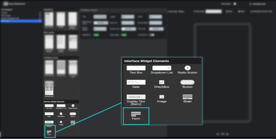
Image - Form Element
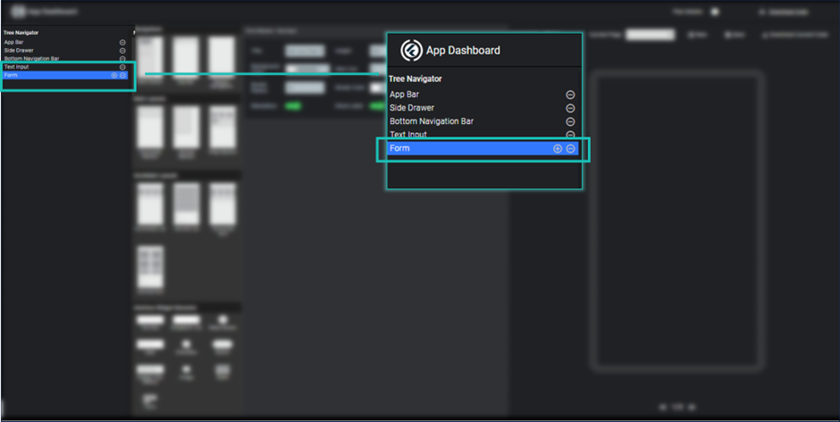
Image - Form Element in Widget Tree
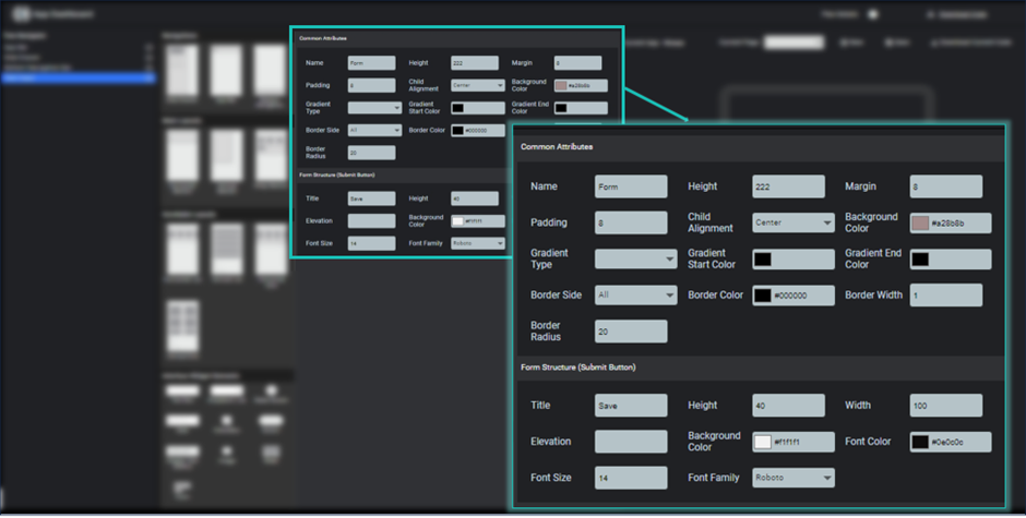
Image - Form Element Properties
It will come as layout and you can add element as per your choice among the given form elements shown right of the element section.
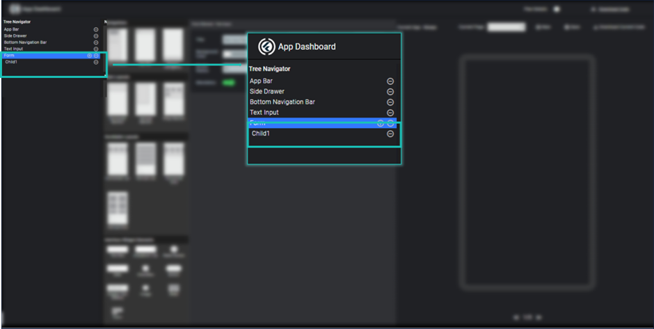
To add any form element into the form layout, you need to click plus icon show aside the form title.
Image - Form Empty Child
After clicking plus icon, it will add an empty child to form element. To add any form element, select the child element and you will have some of the allowed form element shown, to add any of the element just click the icon of the element.
After click any of the item it will be replaced the empty child and respective properties are shown in the properties section, where you can modify as per your need.
Form element always has a button element by default, you can change its title, color and background color etc.
Image - Select Any of the form element for empty child